
Tuesday 28 February 2012


1) In what ways does your media product use, develop or challenge forms and conventions of real media products?

EVALUATION OF MY NEWSPAPER

 To the left are mastheads for 3 local newspapers across Merseyside which I found during my research and planning stage. My product develops the conventions of these mastheads, drawing inspiration from the colour schemes and font types whilst adding a piece of my own creativity to the mix. The reason I have stuck to typical newspaper conventions is because newspapers tend to use very similar font types, and usually choose primary colours such as blue or red to draw the attention of the audience. To go against these conventions would make my product look unprofessional and subsequently my target audience may not be effectively reached, resulting in a loss of profit.
This is the masthead for my local newspaper. As you can see it shares many of the same conventions as the other masheads I have chosen to research. It uses the two main colours associated with Liverpool (red and blue) and also incorporates the liver bird, which is traditionally associated with Liverpool and its culture. For my masthead I tried to incorporate the features I believe are most effective within each individual masthead I researched above.
My masthead looks quite similar to that of the Liverpool Echo, whilst on the other hand it challenges (and in some cases develops) the conventions of the style's presented by The Champion and Daily Post. The Champion and Daily post use a rather thin font type whilst I chose to use a big, bold font to draw the attention of my audience. This style has been used in The Echo, and I chose to capitalise on this as I believe The Echo's masthead is the most effective of the 3. In addition, I chose to put my slogan in with the masthead which is similar to that of The Champion. The Echo and Daily Post do not use this feature which I believe is a pitfall in their presentation. Finally, I have used the same colour scheme as The Echo because it is bold and looks professional.


Here are a few examples of the adverts I created for my newspaper. To the left is a picture of an advert I particularly liked in one of the local newspapers I photographed. I decided to use the same colour scheme (orange and blue) and layout (utilising various bullet points). This advert particularly stood out to me when looking through newspapers so I thought this particular convention would be good to develop as it really jumped out of the page to me, which is exactly what you want from an advert. Whilst doing my research I found alot of adverts relating to PPI in all forms of media (T.V, radio and newspapers) so I decided to research into it and create my own advert.


In my print I decided to add short articles in the bottom corner of both my front page and inside page. This is a common feature in newspapers and was crucial in the flow of the newspaper, without which there would be too many adverts in the lower portion of the page. These conformed to the typical conventions of an article as it is not designed to draw too much attention away from the rest of the page, therefore it would be counter-intuitive to deviate from these conventions. I utilised the typical bold heading and also used the line 'Continues page 4' to let the reader know that there is a more in depth article on the story later on in the newspaper.

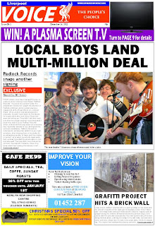
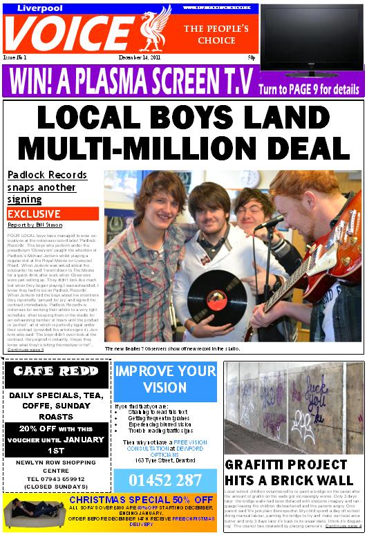
 Here are pictures of my main stories both on the inside and front page along with a picture of a story from an actual local newspaper. This is arguably the most important part of the newspaper as it is what the audience is actually buying the media for, so it has to look professional and follow specific conventions otherwise it may not attract readers. Typically newspapers use either 3 or 5 columns of text in their stories. For my inside page I chose to use 5 columns, taking inspiration from the inside page I have photographed to the left. I believe this inside page is effective as it allows the top half of the page to be dedicated solely to the news whilst the bottom half dedicated to adverts (which are crucial for a local newspaper). Although only the top half of the page was dedicated to the news I still managed to get a significant amount of information in along with some effective pictures. I follow the typical conventions of a newspaper for my inside page and front page story and I believe the outcome looks professional and will effectively attract my chosen target audience.


For the most part I followed the typical conventions of newspaper adverts, generally advertising local businesses and discounts (usually bathroom retailers, furniture sales etc). I did however challenge one of the typical conventions by having a cut out discount card for a cafe. Throughout the local newspapers I researched I don't recall seeing any cut-out vouchers and I thought it would be a good idea to include one in my newspaper. This is a typical convention of a magazine but I believe I utilised it effectively in a newspaper setting.


Here are a few examples of the adverts I created for my newspaper. To the left is a picture of an advert I particularly liked in one of the local newspapers I photographed. I decided to use the same colour scheme (orange and blue) and layout (utilising various bullet points). This advert particularly stood out to me when looking through newspapers so I thought this particular convention would be good to develop as it really jumped out of the page to me, which is exactly what you want from an advert. Whilst doing my research I found alot of adverts relating to PPI in all forms of media (T.V, radio and newspapers) so I decided to research into it and create my own advert.


In my print I decided to add short articles in the bottom corner of both my front page and inside page. This is a common feature in newspapers and was crucial in the flow of the newspaper, without which there would be too many adverts in the lower portion of the page. These conformed to the typical conventions of an article as it is not designed to draw too much attention away from the rest of the page, therefore it would be counter-intuitive to deviate from these conventions. I utilised the typical bold heading and also used the line 'Continues page 4' to let the reader know that there is a more in depth article on the story later on in the newspaper.

 Here are pictures of my main stories both on the inside and front page along with a picture of a story from an actual local newspaper. This is arguably the most important part of the newspaper as it is what the audience is actually buying the media for, so it has to look professional and follow specific conventions otherwise it may not attract readers. Typically newspapers use either 3 or 5 columns of text in their stories. For my inside page I chose to use 5 columns, taking inspiration from the inside page I have photographed to the left. I believe this inside page is effective as it allows the top half of the page to be dedicated solely to the news whilst the bottom half dedicated to adverts (which are crucial for a local newspaper). Although only the top half of the page was dedicated to the news I still managed to get a significant amount of information in along with some effective pictures. I follow the typical conventions of a newspaper for my inside page and front page story and I believe the outcome looks professional and will effectively attract my chosen target audience.
My front page also follows the typical conventions of a newspaper with a large headline, sub-heading and also the use of a picture including caption. I decided to deviate from typical conventions slightly by adding a bright 'EXCLUSIVE' bar just above the text which is a typical convention of a magazine. This added feature was to try and attract the audiences attention and break the mold of boring black and white newspaper articles.
Mcshane set out 5 central tenets which journalists tend to follow: Conflict, danger to the community, the unusual, scandal and individualism
My newspaper incorporates most of these into the stories that are presented in both the front and inside page. On my front page there is a story about a local band, which promotes individualism, and also a story on how a graffiti project has been sabotaged by local kids (this could be classed as 'scandal'). Then on the inside page there is a story on local yobs terrorising the community (which could be classed as 'conflict' or 'danger to the community'). From this we can see that my newspaper follows the 5 central tenets in which Mcshane suggested journalists tend to follow. So, the content of my newspaper follows the specific genres Mcshane suggested, and all of my text, logos, and colour schemes follow the same basic outline that most (if not all) local newspapers tend to follow. Therefore, it is evident that my product does not deviate greatly from the boundaries of genre set by the newspapers that I have researched.
2) How effective is the combination of your main product and ancillary texts?
To make my products look professional and stand out from the rest of the competition I needed to have consistency between my main product and ancillary texts. Stephen Neale said 'Genres contain a set of expectations'. This consistency was achieved through various methods, most notably the application of the same colour scheme, logo and slogan on to each of my platforms.


The production of my poster supports the encoding/decoding theory. As the producer I encoded my poster with the questions 'Need a voice of the local people? Need a paper that tells it how it is?' to try and imply that my newspaper provides these things (whereas other newspapers may not). However, the cultural competence theory states that my audience may have decoded my poster with different meanings to what I intended, although I believe my poster gets its message across very clearly. This encoding and decoding makes my ancillary text effective when used in conjunction with my main product as it makes the reader think about the poster rather than passing it by unnoticed.
Research has shown that consistency throughout different platforms attracts more readers, whereas inconsistency lacks the promotional impact required to sell copies. With this research in mind I aimed to transfer as many of the details that make my product original over to my poster and radio in order to reach out to my target audience more effectively. These pictures show how I used the same logo on my main product in my ancillary product.

I differed from typical poster conventions by not including my slogan 'The people's choice' and chose instead to elaborate by adding 'Your news, your voice' which I believe is more effective for my poster. It follows the same style as the top text of the poster (with two questions in bold with red and blue backgrounds) and keeps the flow of the poster punchy and dynamic. I did however include my slogan 'The people's choice' in my radio advert as it fitted in well with the dialogue of the advert. I believe not including the slogan in my poster was a positive choice so that it doesn't get overused and stagnant from using it across every platform, although some may argue that not including the slogan creates inconsistency. I have had mixed views on how effective my poster is through my feedback. I decided to go with what I thought was most suitable since the opinions were so varied.

The production of my poster supports the encoding/decoding theory. As the producer I encoded my poster with the questions 'Need a voice of the local people? Need a paper that tells it how it is?' to try and imply that my newspaper provides these things (whereas other newspapers may not). However, the cultural competence theory states that my audience may have decoded my poster with different meanings to what I intended, although I believe my poster gets its message across very clearly. This encoding and decoding makes my ancillary text effective when used in conjunction with my main product as it makes the reader think about the poster rather than passing it by unnoticed.
3) What have you learnt from your audience feedback?
Audience feedback was crucial in the creation of all my products. I mainly used the social networking site Facebook for my audience feedback and also asked my fellow peers and friends what they thought of my products whilst I was in the creative process. An example of a time when I thought audience feedback was extremely beneficial was in the early stages of my front page production. I posted a picture of my front page on Facebook and asked my friends to leave constructive criticism. Below is a screenshot of a few of the comments.

Most of the comments addressed the same issues, such as: The size of the font in the story, the sparsity of the bottom right corner and the border around the story. In addition they all seemed to like my main logo and adverts. After this audience feedback I subsequently changed these issues and repeated the process.

This audience feedback suggests that my audience is active and not easily brainwashed. This goes against the hypodermic syringe theory which takes a negative view of how the media affects it's audience, suggesting that the audience is passive and easily manipulated. Clearly my audience has commented on the quality of my story and appearance of my newspaper, therefore they are taking an active interest in the production and content of the local media. My audience commented on my products in relation to 'the need to be informed' and if they were not satisfied with the story they would tell me what they disliked about it, knowing that I would alter it.

My radio ad received a massive amount of positive feedback, so I was extremely pleased that I didn't have to change anything. As for my poster, I simply showed my peers in media and asked them to rate it on a scale of 1-10. I gathered a considerable number of results and the average score for my poster was 6.5. After this I went back to the drawing board and repeated the process until my average score was raised to 8. Once this was achieved I consulted my teacher on what he thought would make my poster more effective, and made changes accordingly. This method of rating and repeating was extremely effective in refining my poster until I was happy with the end product. Surprisingly my poster was originally very complex, but through this filtering system it gradually got more and more simplified. From this I learnt that advertisements need to be simple and bold to draw attention rather than being crammed full of information.
Subscribe to:
Posts (Atom)